Our brand identity is represented by a geometric shape that resembles the infinity (∞) symbol, which is composed of a grey U and a green N.
The name of our company, UNZIP, was inspired by the two metaphors associated with ZIP, which are “move at high speed” and “energy; vigor”. Meanwhile, the word “UNZiP” itself signifies the release of all limitations.
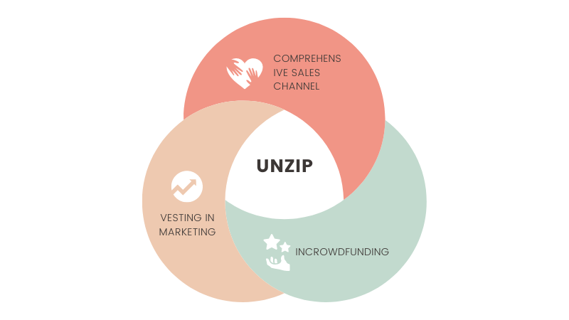
Our goal is to offer:
Consumers with relief from stress and the ability to maintain joy and vitality in a fast-paced life.
Manufacturers with the ability to showcase product value andcharm through diverse marketing channels.
In addition to the concept of infinity (∞), the logo also represents the meaning of cooperation, like a handshake, symbolizing the mutual benefit formed between our company and manufacturers/consumers.
My Experience
2014
Enter the brand agency industry.
2014~
2022
Contact more than 100 brands from Japan, South Korea, Europe and the United States, successfully act as an agent for 15 brands, participate in more than 200 marketing project discussions, visit and participate in more than 60 domestic and foreign exhibitions.
2023
Brand re-engineering, concept rebirth, UNZIP was established.